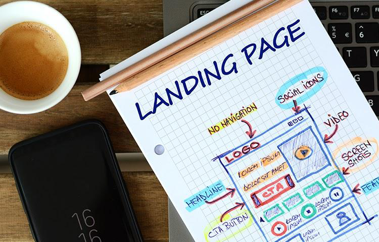
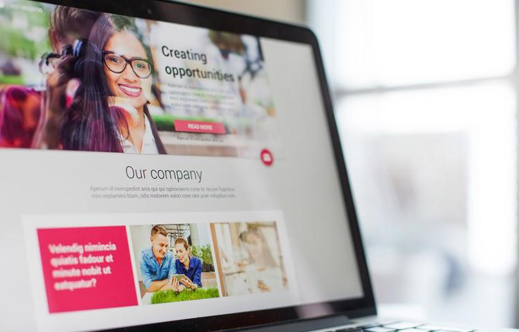
The prospect has clicked the link and hit your landing page. Now, you need to make sure this page offers everything that they expect to see.
A basic ad campaign goes something like this:
You create the ad that gets shared on the platform of your choosing. The ad contains a link, which a prospect clicks to arrive at your landing page. The prospect then fills out the form on the landing page to get their hands on what you’re offering.
In return, you get a lead or may even make a sale.
Of course, the general formula gets tweaked depending on the nature of the campaign. But the key takeaway here is that your landing page is extremely important.
A poor landing page can undo so much of your hard work. Worse yet, it’ll cost you a lot of money as prospects that you’ve paid to attract bounce away instead.
You need to ensure your landing pages offer exactly what the prospect expects when they click on an ad.
This means they need to look the part and provide all of the necessary information. They also have to make it easy for that prospect to access the offer that attracted them in the first place.
In other words, your landing page can’t just be a random page on your website.
But if that’s the case, what should it be? What elements does it need to contain?

Read on to find out the answers.

Element #1 – A Great Headline
The headline is the first thing that the prospect will see when they arrive at your landing page.
It has to keep their attention. The ad has already compelled them to click through, but your headline has to convince them to keep reading.
There are three things that a headline needs if it’s to work for your landing page:
- The headline must be relevant to the ad that the prospect clicked on. If there’s a disparity in the messages, you can expect the prospect to bounce.
- The headline must address a key pain point for the prospect. Also, you need to offer a degree of empathy for that pain point. Show the prospect that you understand and want to help.
- Clarity is key when it comes to a headline. Pick a single point and focus on it. When you try to add too much, you create a jumbled message that turns prospects off.
You may also consider adding a sub-headline if you need to add more detail. Typically, this will go underneath the main headline and must have a smaller font. It will also build on what the main headline tries to communicate.
Element #2 – Social Proof
All of your prospects understand that you’re making an offer to them. You’re asking them for something in exchange for something else. This may be money in exchange for a service, or it could be something like an email address in exchange for a piece of content.
The point is, we all know the landing page is essentially a sales page. And the people who land on it want to hear your pitch.
Except… they don’t really want to hear you go into sales mode.
They want to confirm that you can solve their problem.
This is where your social proof comes into play. These are the recommendations that come from previous clients that show you can deliver.
Examples of social proof include testimonials and written case studies. Ideally, you’ll have a video that proves, without a shadow of a doubt, that the person offering the information actually exists.
The key here is that your social proof demonstrates the key benefits that you brought to this person’s life.
Beyond your clients, you can’t offer other forms of social proof. For example, any awards that you’ve received for your service works as social proof. So too do any major brands that you’ve worked with.
The goal here is to create trust. You need to show the prospect that you’re legitimate, which means they’re more likely to convert.
Element #3 – Quality Images
You’re always going to have to strike a balance between text and images on a landing page.
You want to leverage images to grab attention and keep the prospect engaged. However, bad images can have the opposite effect.
For example, let’s say you use an image of your product on your landing page. But the image has a poor resolution and it’s clearly stretched out.
What kind of impression will it give to your prospect?
It says that this organization isn’t professional enough to get decent images designed. They may even question your legitimacy and assume you’ve simply pulled your images from elsewhere on the web.
The simple tip here is that quality matters when it comes to your images. It’s often worth investing in a professional designer’s services to ensure your graphics are up to snuff.
Automation Agency can help here. We offer several image design services that you can use when crafting your landing page. Send a task to the Concierge Service to find out more.
Element #4 – A Simple Lead Capture Form
There’s a simple rule to keep in mind when designing your lead capture form:
The more you ask for from your prospects, the less likely they are to send you their details.
People don’t want to fill out pages and pages of forms just to register their interest with you. They want to get in, get what they came for, and get out again as fast as possible.
So, simplicity is key when designing these forms. Always aim to ask for the bare minimum amount of data as possible. Often, this could be as minimal as asking for a name and an email address. That’s all you need to insert a prospect into your funnel and begin nurturing them.
Now, we come to placement.
The conventional wisdom is that you should place your form above the fold. This means making it visible before the prospect even scrolls down the page.
However, it appears that scrolling isn’t as big of an issue as many believe it to be. According to a study from Clicktale, which provides analytics solutions, 76% of people scroll down on a web page.
So, don’t get married to the idea of putting your form above the fold. Do it if it makes sense but don’t try to force your design to fit the concept.
And again, the Automation Agency can help if you need to design a lead form. Contact the Concierge Service to find out more.
Element #5 – Good CTA Placement
Your CTA is your call to action. It’s the content chunk that you’re going to use as your final attempt to get a prospect to take the desired action.
That means you need to position it logically.
Far too many people place their CTAs at the top of the landing pages. They make the offer before they make their case. And naturally, many prospects see this and bounce away. After all, they want to see more than a pitch before they make a choice.
Your CTA should come after you’ve introduced and expanded on the offer you’re making. Aim to make it as visible as possible and ensure that other page elements guide the prospect towards it.
Just don’t let it be the first thing that a prospect sees.
Element #6 – Sharing Options
The ultimate aim of a landing page is to convince somebody to take action.
However, that is not its only use. A well-designed landing page contains plenty of useful information that’s worth sharing with your prospects.
So, make it easy for anybody who lands on the page to share it.
Include sharing options for all of the major social media platforms. Ideally, anybody on the page should be able to share it in just one or two clicks.
This likely won’t get you anywhere near as many conversions as your ad campaigns. But every share provides you with free exposure for your offer. It only takes one or two conversions to make the addition of these options worthwhile.

Get Ready for Landing
The quality of your landing page plays a huge role in the success of your marketing campaigns.
You need each of the elements on this list to create a landing page that leads to more conversions.
The good news is that Automation Agency can help you with that. We offer several services related to landing page design, including image and form creation. Just shoot a task over to the Concierge Service to get started.
And if you’re not yet a member, chat with our Right Fit Chatbot to find out if we can work together.


