
Turning your website into a lead-generation machine is not a naive dream. You have all the tools to make it happen.
However, if you aren’t optimizing the way you use opt-ins and CTAs, then you’re letting a lot of traffic go to waste.
Throwing in a simple “sign up for free updates” box isn’t good enough.
Below we will highlight the importance of opt-ins and reveal how five clever locations can increase your leads.
The Importance of Opt-Ins
According to Exact Target, “77% of consumers prefer to receive permission-based marketing communications through email.” How do you collect those email addresses? By using opt-ins, of course!
Your CTA can be anything – a button, a banner, or an email opt-in box.
For the sake of this post we’re going to use the terms “CTA” and “opt-in” interchangeably, even though they are slightly different in nature. After all, they have the same end goal: to get your user to take a specific action and move further down your conversion funnel.
Without opt-ins your users have nowhere to go. Once they read your content, they’ll probably just leave your site. Unless you prompt them to take some sort of action.
This is where opt-ins come in.
CTAs Alone Won’t Cut It. You Also Need A Powerful Lead Magnet.
CLICK HERE to Download Our “12 High-Converting Lead Magnets” Cheat Sheet.
Why Your Opt-In Locations Need to Be Maximized
Most business owners know they should be collecting leads. So maybe they added a tiny subscription box in the sidebar that says, “Free Updates”. Now, they feel like their work is complete.
They sit back and wait for the flood of visitors to happily enter their email addresses into the enticing box.
Sadly, the email subscribers don’t come.
Offering a free lead magnet and optimizing your opt-in locations will help you get the most from your opt-in boxes. A single opt-in box isn’t enough.
The more your users are exposed to your opt-in boxes, the more likely they are to subscribe, eventually. Plus, not every user will see your homepage when they visit your site for the first time.
5 Clever Places to Add Your Opt-Ins
Adding an opt-in to every page of your website significantly increases your chances to generate new leads. Below we offer five opt-in locations you might not have tried yet.
Option #1 Pop-Ups
Most people have a love-hate relationship with pop-up opt-in forms. But one thing can’t be overlooked. They work.
Entrepreneur.com was able to increase subscriptions by 86% by using pop-ups across their site. And just take a look at this beautiful overlay pop-up from Neil Patel.
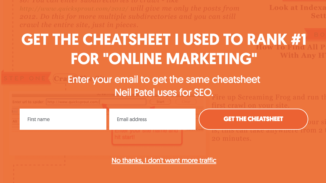
Now, pop-ups aren’t effective in every industry, but it’s definitely worth testing. There is no harm in posting a pop-up for a week and seeing how it improves your conversions.
Option #2 Your About Page
Your About page probably gets a ton of traffic. Take a look at your Google Analytics stats – I bet that page gets significant traffic numbers. How are you going to take advantage of that?
By adding an opt-in to the page.
A great example of a Call To Action on the About Page is on our friend Chris Ducker’s About Page:

Your About page helps your visitors build a connection with you. Once you’ve delighted them with your story and how you can be of service, chances are high that they’ll want to sign up to hear more from you.
Option #3 Within Your Posts
You might already have an opt-in at the bottom of your blog post, but what about adding one inside your content?
Whether you should include opt-in boxes in your content depends on the length of your posts. If the posts you regularly produce are upwards of 2,000 words, then there’s plenty of room to include an opt-in.
To further increase conversions you can include an opt-in that relates to the topic of the post, or that contains a case study that puts the information in the post into action.
CLICK HERE FOR 12 LEAD MAGNET IDEAS FOR YOUR NEXT ONLINE SALES FUNNEL
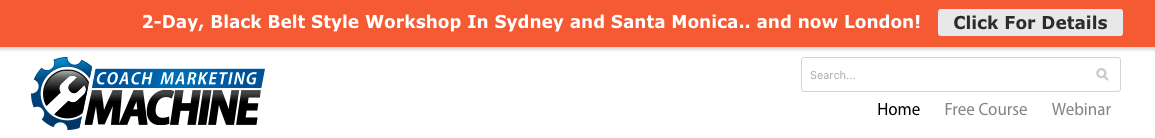
Option #4 Hello Bar
Maybe you’ve seen the little bar that drops down from the top of some sites. Like the pop-up, it won’t work for every type of site, but it’s worth testing.
The most common plugin for installing the top bar across your site is Hello Bar. This style of opt-in box is usually preferred to a pop-up, as it’s less intrusive and doesn’t distract your visitors.
A great example of this is over on our friend and client Taki Moore’s Coach Marketing website promoting his workshops in Sydney, London, and Santa Monica
Option #5 Feature Box
The feature box is a little box at the very top of your site that immediately hooks your visitor’s attention. Take a look at DIY Themes, to see it in action.
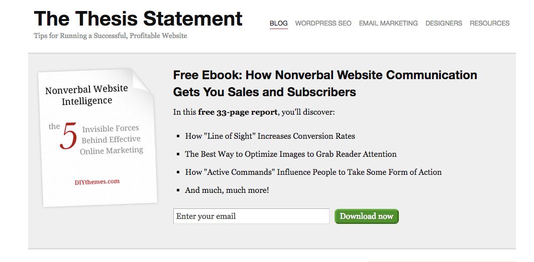
These little boxes can convert at a very high rate and immediately tell your visitor what your site is about.
If you want to optimize your conversions and increase your website’s lead generation abilities, it’s important to include as many opt-in forms as possible.
Hopefully, you’ve now had a few ideas on where you could add more opt-in offers to generate more leads, if you need some help to get them added to your site then our web team would love to assist.
