When you chose the colors for your website or product packaging, did you stop and consider what those colors actually mean?
No? You’re not alone. Most of us don’t think about it very often, but colors evoke unique feelings. From the walls of your office to the colors in your company’s branding, particular colors are used to boost creativity, induce calmness, or even create excitement.
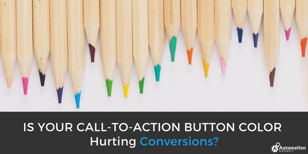
However, the wrong choices could have the opposite affect. In fact, a poor color choice might be hurting your conversions – especially when it comes to your call-to-action buttons.
Your call-to-action button should encourage customers and clients to convert. And if you’re using a color that turns your target audience off, you may be pushing them away.
How Color Affects CTA Engagements
Color can draw a shopper’s eye to a particular part of the page or even encourage them to take out their wallets. On the other hand, it can also be distracting or even create the wrong image in your customer’s mind.
To improve your CTA conversions, you need to feature the right color. When deciding on the right color for your CTA button, you want to keep a few things in mind.
Is Automation Agency The Right Fit For You? Take this quick quiz to find out!
1. Color Can Create Brand Recognition
Your company’s branding can help you stand out from the crowd. When you consistently use the same colors to represent your brand and content, your clients and customers will start to identify your pieces faster. This can improve trust and make them more likely to convert.
Using your company’s brand colors for your CTA buttons can not only create consistency on your website, but it can also build upon that brand awareness. HubSpot, for example, uses their classic orange color for CTA buttons throughout their website.
Choose a color from your branding that is unique to your business. This can help you stand out from your competitors and make it easier for customers and clients to identify your brand.

2. Color Can Create a “Pop”
Your website visitors are busy people. When they get to your page, they don’t have time to comb through text boxes and black-and-white pages looking for the information they need. Instead, you want to make the most important parts of your website stand out.
Color is the best way to create a “pop” on your page, especially when it comes to CTA buttons. However, you’ll want to include more color throughout your website than with just your CTA buttons. Links, headlines, and your navigation should also be in color to stand out, but choose a unique color for call-to-action items.

For example, Help Scout uses their blue color to make their CTA buttons stand out from other links. This bright blue color pulls the attention in that direction, encouraging new users to sign up for free, while their other links and navigation have their own unique color.
3. Color Can Show Personality
Brand personality can help your company stand out from the crowd. When you create a strong brand image, you can differentiate yourself from your competition and help potential shoppers determine if you’re the right brand for them. While color isn’t the only factor that contributes to a brand’s personality, it can help.
Certain colors are often used to invoke certain feelings. Red, for example, is often a sign of a bold company. Blue means dependable, while orange creates feelings of confidence or cheerfulness. Choosing the right color can create a subconscious image with your target audience

Take Sprout Social, for example. They use the color green throughout their branding and for their CTA buttons. While this plays off their name, it also implies that the business is healthy and growing, and that their tools can help you grow your business as well. This solidifies the brand’s personality with the customer, encouraging them to connect.
Finding Your Right CTA Color
It can take some trial and testing to find the right color to use in your CTAs. While a color may work great in a case study or for another company, it doesn’t necessarily mean it will work well with yours. In order to find the right color to use in your CTA buttons, you need to know your target audience.
Men and women tend to prefer different colors, while age can also influence what colors the individual may connect with. Knowing how your target audience engages with different colors can help you decide which to feature in your CTA buttons.
Is Automation Agency The Right Fit For You? Take this quick quiz to find out!
A/B testing can also help you find a CTA color that can land more conversions. By running two different campaigns with different CTA button colors, you can see which has a greater effect on your target audience. Through proper tracking and monitoring, you can find the CTA button color that improves your image and evokes more sales.
