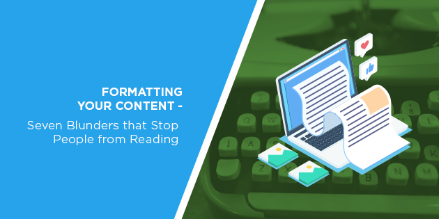
As business owners and content creators, we tend to focus predominantly on our content’s substance. But even the greatest piece in the world will get ignored if it looks terrible.
You spent an eternity crafting an amazing piece of content. Hours went into researching all the stats and honing your message. You redrafted the piece half a dozen times and now you’re finally ready to unleash it onto your audience…
And nothing happens.
The comments section is a barren wasteland. Nobody’s sharing the post on social media and your analytics tell you that people bounce from the page almost as soon as they land on it.
Is your masterpiece really as bad as all those metrics indicate?
Probably not. Instead, what you may have here is a content formatting issue. In the online world, where everyone’s vying for your prospects’ attention, first impressions count for a lot.
If your content doesn’t look the part, people aren’t going to stick around to find out what it’s saying.
If you can nail your formatting, your best pieces of content will perform even better. And to do that, you need to avoid these seven common mistakes that lead to less engagement.

Mistake #1 – Not Testing Content Across all Browsers and Devices
The sheer number of ways that people can access your content today is staggering. Desktops, smartphones, tablets, and even video game consoles have internet browsers. Even smart TVs often come installed with a browser.
And speaking of browsers, there are a bunch of those to consider too. You have Chrome, Edge, Firefox, Opera, Safari, and many other browsers to consider. And each of these has its own specific ways of displaying your content.
With that in mind…why would you only check your content on one device? To really perform well, it has to look good on all devices, with all browsers.
This is one of the biggest mistakes that business owners make when it comes to online content. They assume that the content looks fine for everybody because it looks fine on their specific setup.
For example, let’s say you use a desktop computer and Chrome to read the content. That same piece of content may look very different on another browser. And if you don’t have a responsive or mobile-friendly website, it may look terrible on portable devices.
The good news is that you don’t need to check every device for every piece of content. However, you do need to check that your website displays well on all devices and browsers. As importantly, you have to keep track of changes in these devices and browsers that could affect your site design.
Mistake #2 – Creating Walls of Text
Imagine that the content you’re reading right now was just one huge mass of text. That means no spaces between paragraphs, no images, and no headings or subheadings.
You’d click away, right?
The wall of text is one of the biggest turn-offs for online content consumers. That giant block of text will overwhelm the reader to the point where they just give up.
Remember that this content goes out to an audience that’s bombarded with tons of messages online. If you make your message difficult to read, people just won’t bother.
Read through your piece before you put it out there.
If it feels like a slog to get through a paragraph, you need to break it up into smaller sections. If you find your attention waning, you likely need to insert a subheading or image to break things up.
The latter is something that Automation Agency can help with. Contact our Concierge Service if you need attractive images for your blog post or landing page.
Mistake #3 – Poor Colour Coordination
Your colour selections also play a big part in how good your content looks.
In the early days of the web, we saw people experimenting with all sorts of strange colours. But today… let’s just say that there’s a reason why most web designers go for black text on a white or light background.
Again, this comes down to making it easy for the reader.
Your prospects aren’t going to sit there and strain their eyes just to find out what you have to say. They’re going to go to the next influencer, who’s coordinated their colours, and read their content instead.
This is another area where Automation Agency can help you. We’re specialists in landing page design, which means we can help you choose appropriate colours for your pages. Send a task to our Concierge Service to find out more.
Mistake #4 – Overuse of Bold and Italics
You can use bolding and italics to emphasise the key points you make.
The problem arises when you overuse them. If you have entire paragraphs written in a bold font, you’re not creating emphasis. You’re creating a standard. The text isn’t going to stand out because everything around it is in bold too. The same goes for using italics.
It’s best to use these formatting options to emphasise specific words or phrases. These are the instances when they’ll have the strongest impact on your reader.
There’s also a practical reason to avoid the overuse of bold text. In the early days of search engines, people bolded keywords to highlight them.
The tactic got abused so much that bolded text no longer carries any weight for search engines. Some may even see too much bolding as an indicator that you’re trying to game the search rankings.
And even if the search engines are fine with it, your readers will see it as a dated tactic.
Mistake #5 – Failing to Keep Skimmers in Mind
Not everybody has the time to read your epic 5,000-word magnum opus of content. This is an unfortunate fact that may bruise your ego.
But it’s something you have to account for with your formatting. Some people may come across your piece while they’re on the move. Others may just want to find a specific piece of information in the content.
You have to make it easy for these readers to skim through your piece.
Using subheadings helps here, as does a short table of contents if it’s a particularly long piece. Bulleted and numbered lists can also help you to emphasise specific stats and points.
Mistake #6 – Using Long Sentences
We’ve established that long paragraphs are a bit of an eyesore. But sentence length is something that a lot of content creators don’t pay as much attention to.
Sentences in pieces of online content shouldn’t run for multiple lines. Again, you’ve got to remember that your audience isn’t looking to read a thesis here. They want useful information delivered as concisely as possible.
If you have long sentences, it’s likely that you’re covering multiple points in one sentence. This creates confusion for the reader. And then their attention will soon drift away to something easier.
Again, it’s about making things as easy for the reader as possible. If people have to stop and figure out what a sentence is trying to say, you’re not doing that.
Mistake #7 – Using a Tiny Font Size
It’s never been a best practice to use a small font for your content. And again, it all comes down to making the content as easy to consume as possible.
You can’t assume that your readers will zoom in if your font is too small. They’re more likely to bounce away from the page than they are to put extra effort into reading.
Furthermore, you have to consider devices again here. A font may look fine on a large desktop monitor. However, you also have to ask if it’s large enough for a smartphone screen.
This is where having a responsive website pays off. With a responsive design, your site will adjust font sizes depending on the device used to view the content.

Formatting Is as Important as the Actual Content
We’d all like to think that the value our content offers is enough to convince web users to look past formatting issues.
Unfortunately, that just isn’t the case. People have certain expectations of what good content should look like, as well as the value it should offer. If your content has poor formatting, many of your potential readers will just move onto the next webpage.
And that means you’ve missed an opportunity to bring someone new into your sales funnel.
With these tips, you’ll nail the formatting of your content. And out Concierge Service can help with several parts of the process, including image creation and landing page design.
Are you thinking about signing up? Chat with our Right Fit Chatbot to find out if we’re the right people for the job.
