Critical to a successful marketing funnel, your landing pages must be optimised to attract plenty of paying customers.
Right off the bat, creating a landing page may appear straightforward. This is true, as long as you know what you’re doing. But let’s dig a bit deeper to see what landing pages are all about.
By definition, a landing page serves one primary purpose – it’s a page that’s part of your marketing campaign or funnel where your clients can “land” on.
It’s often the same as your home page, but it can also be different. However, this is only in terms of the function, not its design or UI (User Interface), which should still be in line with your company’s branding and website layout.
There are a few different types of landing pages. For example, you can create a page to offer additional info, trade freebies for client credentials, or use it as a click-through tool to get customers to an e-commerce platform.
The preferred type depends on your niche and business goals. But regardless, there are specific criteria that make a landing page ideal for conversions.
This article explores those criteria and gives you 10 actionable tips for creating powerful landing pages that convert.

10 Tips for Creating a High-Performing Landing Page
Tip #1 – Pay Attention to Colours
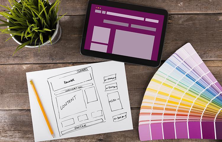
The colour scheme of a landing page isn’t only a matter of preference or your brand’s graphic standards. There is clear logic and science behind colours that actually attract attention.
For example, orange stands for warmth and clarity, green for vitality, growth, and money. Meanwhile, blue conveys something solid and dependable, red is boldness and excitement, and white is neutral, balanced, and calm. And if you want to show imagination and creativity, you can go with purple.
The reality is that most companies choose colours that represent their value proposition. For instance, you wouldn’t want to use orange if your products are creative and imaginative.
Also, your branding shouldn’t burden a landing page with too many colours. A plain white background with splashes of colour would be ideal.
But if you’re not sure which colours are suitable for your offer, Automation Agency can help. Just send a task to our Concierge Service.
Tip #2 – Make It Mobile-Friendly
If you don’t make your landing page mobile-friendly, you’re missing out on a massive chunk of the market. However, know that there are specific guidelines to making a page friendly to mobile users.
For one, people generally don’t fill out forms on mobile devices. This means that you need to find a clever way to make the signup process easy for your potential customers. To make that happen, you can integrate Google or social media signup and allow users to complete the action in one tap, for example.
The point is to make it easy.
Additionally, being mobile-friendly means the page is easy to navigate. It has to lead a visitor directly to the next step.
Tip #3 – Keep It Simple
This tip means making the landing page well-organised, clean, and minimalist. After all, the page design has a significant impact on conversions.
Remember, the idea behind a landing page is to first capture a visitor’s attention before leading them through the page to take action. But this isn’t something you can achieve if the page is cluttered.
Creating a minimalist page is about being smart with your use of images and colours. You also want to make navigation natural and remove distractions such as pop-ups.
Do your best to keep the vital information above the fold. All other information should reveal itself as visitors scroll down the page.
You may go with a simple design throughout and stick the details towards the bottom of the page.
Tip #4 – Offer Value
Once you have a value proposition that resonates with your target audience, you need to make that value evident to them.
More specifically, your landing page has to clearly explain the value. Landing page headlines are the ideal tool to communicate that value without beating around the bush.
You should confirm the offer in the headline and use sub-headings to explain further. A good example may look like this:
Free Course to Boost Landing Page Conversions – headline
Learn the Tricks to Quickly Improve Your Landing Page Performance – subheading
There’s also an option to push the value proposition right in the headline. And if you’re looking to identify a strategy that works for you, it’s best to do some testing to determine which one gets you the best results.
But the critical thing is that you only have eight seconds to capture the visitor’s attention. So, work on making the headline as compelling as possible.
Tip #5 – Have Compelling Images
As indicated, you shouldn’t go overboard with your images. Do your homework and find a handful of images that make sense for your offer. For example, 3-5 properly positioned and formatted images may be all you need.
It’s critical to make the images representative of your brand and offer. If you’re selling software services, for example, don’t use dreamy landscapes. On the other hand, images of people doing stuff on their computers may set the scene for user expectations.
The same logic applies to all other visual elements on the landing page. And if you choose to incorporate a video, one should be more than enough. But be careful when doing so because a poorly integrated video may slow down the page.
Also, if you want to have other kinds of graphics, consider cutting down on images. You can even skip images altogether.
Test #6 – Perform A/B Tests
For many marketers, landing page forms are the main focus since they are vital to securing high conversions. But the forms must be properly located.
To figure out the ideal positioning, you need to A/B test them. That being said, it’s not like there are rules that you need to follow. Based on your niche and audience behaviour, there could be a strong preference for a specific form placement.
For instance, a website recently tested forms placed on the left with a decent conversion rate of 11%. But when they moved the forms to the right, conversions spiked to 16%. This 5% difference may translate to a significant increase in revenue.
And of course, you can also test the landing page content, CTA copy and placement, graphic styles, etc.
Tip #7 – Landing Page Structure
A common problem of underperforming landing pages is improper formatting. Due to that, there’s a disruption in the flow as visitors browse the page and fail to convert.
The usual formatting is top to bottom where you have a CTA at the end. These pages have performed exceptionally well, but there’s an even better way to entice your visitors to convert.
Since some of them won’t scroll to the bottom, why not give them the CTA much earlier? In fact, there are some super-successful landing pages that managed to incorporate a snappy CTA above the fold.
Yes, moving the CTA up may appear unnatural. But you’re likely to get much better results if you do so.
You can also use two or three CTAs if your landing page is lengthy. Just don’t go overboard and risk offending your audience.
And if you’re not sure about proper CTA placement for your landing pages, Automation Agency can help. Send a task to our Concierge Service for the best CTA positioning and landing page design.
Tip #8 – Establish Brand Credibility
Over the years, landing pages have evolved to become more natural. The general idea now is to not sound overly salesy.
Non-salesy means that you shouldn’t focus on selling the offer directly. Instead, you want to offer valuable information and lead the visitors to make their own choice. This amplifies the credibility of your offer.
It’s also good practice to introduce social proof in the form of reviews, testimonials, or case studies. This gives credence to your claims and helps establish trust with the audience. Again, you should test different things to find the best social proof.
Tip #9 – Nail Your CTA
If your CTA simply says “Submit”, it’s high time to rethink it.
As for the CTA copy, you should have more than one word. A decent example is Less Accounting’s “Let’s do it!” for the friendly and actionable copy. Understandably, it does sound like Nike’s tagline, but the CTA clearly shows the logic that you should follow.
On top of that, the colour, size, and design of the CTA button play an essential part. You want to make the colour as eye-catching as possible to make it stand out from the landing page background.
Additionally, there’s an ongoing debate about whether CTA buttons should be boxy or rounded. Test both of them for your landing page to see if a simple design tweak can boost conversions.
Tip #10 – Say “Thank You” In the End
Adding a “Thank You” note after a visitor has completed the necessary action is a nice touch. It helps you build rapport with your audience and shows appreciation for the effort.
In fact, a thank-you note is one of the few elements that work well as a landing page pop-up. That’s as long as you make sure that the pop-up is totally unintrusive.
But whatever you do, don’t try to upsell with your thank-you pop-up.

Getting Sky-High Conversions
What are the marks of high-converting landing pages?
It all starts with understanding what your audience wants. That’s how you can come up with a valuable offer.
Remember, your goal is to lead visitors to a conversion, not selling by any means. So do your best to come up with a simple page containing just enough pertinent information about your offer.
Also, be careful when selecting the colour scheme and other on-page elements. And when you’re happy with the final design, it’s essential to test different approaches and strategies to find one that really moves the dial.
Now, you might not be a design expert, but Automation Agency can lead you in the right direction. We can provide you with landing page mock-ups representative of your brand and adhering to the tips discussed in this article.


