
Design is often perceived as how something looks, but more often than not, it’s also how something works.
We’ve all visited a site and been greeted by an opt-in form asking us to sign up for a newsletter or download a free resource. More than likely, we’ve also experienced a form that was confusing and frustrating to use, or at least left something to be desired design-wise.
As users, we’re more likely to abandon the opt-in process when the form is poorly designed or just doesn’t make logical sense. As business owners, the same is true for our customers and prospects, meaning an inferior opt-in form negatively affects conversion rates. But a well-designed form? It can send them through the roof.
Is Automation Agency the right fit for you? Take this quick quiz to find out!
Best Practices for Designing Opt-in Forms
If your’e looking for higher conversion rates (who isn’t?), here are a few proven ways to improve your online forms for a more user-friendly experience.
Shorter Forms
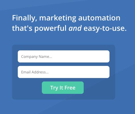
Shorter forms tend to perform better simply because they take up less time and ask for less information.
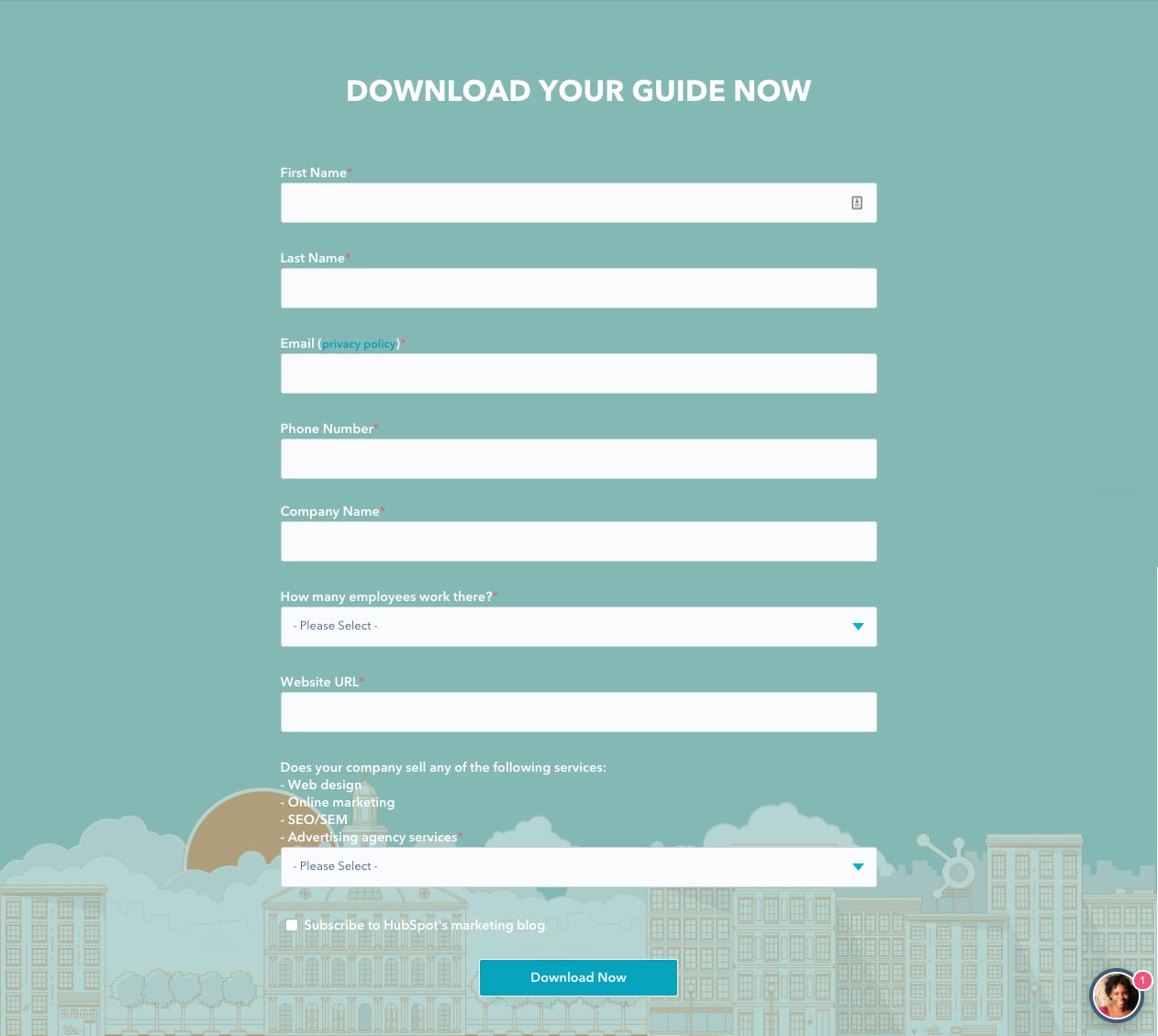
Asking for unnecessary information, like the form above to download an ebook, takes too much time to complete. Often, it makes the user wonder if they actually want to be bothered, and you’re likely asking for some information that they don’t want to give.
Instead, focus on the details you really need. Asking for a first name and email address is standard, but anything beyond (like a phone number or address) should be relevant to the resource you’re offering.
Better Readability
Labels for fields should be placed above the field ,or inside it using Ghost text, rather than next to it. User testing has revealed this to be the least confusing approach for the user because it improves readability.
Your questions should also never be placed side by side. Forms that stick to a single column format are the least confusing to the user and result in a higher completion rate.
Incentivize the Form
Most forms have a purpose, they’re not there just to gather names and numbers. These tend to be things like site memberships, newsletter signups or special offers. If there is a good reason for people to fill in your form, make this clear in the design or call-to-action! Let users know exactly what they can expect after signing up.
Use Clever Defaults
If there is a way for your form to autofill certain fields, such as picking up the user’s country from their IP address, this can streamline the process. The same can be applied to the area code. But be careful to never lock these options in. Always let the user edit the field in case the default is wrong.
Use the Right Type of Fields
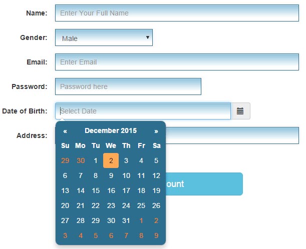
This form uses a date picker for the user to enter their date of birth. This is simpler than asking them to write it out.
Make sure you’re using the best type of fields for your questions. For example, radio buttons tend to be best when there are a few options but only one can be selected. Drop down menus work well for longer lists such as country names, and checkboxes are used when multiple options can be selected.
Just be careful to check how long dropdown lists behave on smaller screens and sure that they don’t collapse when the page is scrolled.
Make Better Use of Your CTA Button
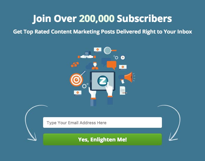
Terms like Join Us or Learn More tend to be more enticing to users than the standard Submit or Subscribe. And if you really want to catch the user’s attention, try something more creative (like the example above) to do the trick.
The copy on your call-to-action button is a prime candidate for A/B testing as well. Depending on your form’s purpose, an enticing phrase such as Start Making Money Now or Send Me Free Updates can also lead to better conversions.
Add a Privacy Statement
Privacy is an understandable concern for many users. A single line assuring the user that you won’t sell their information will help convince them that signing up won’t equal a ton of spam or other unsolicited emails.
In-line Validation
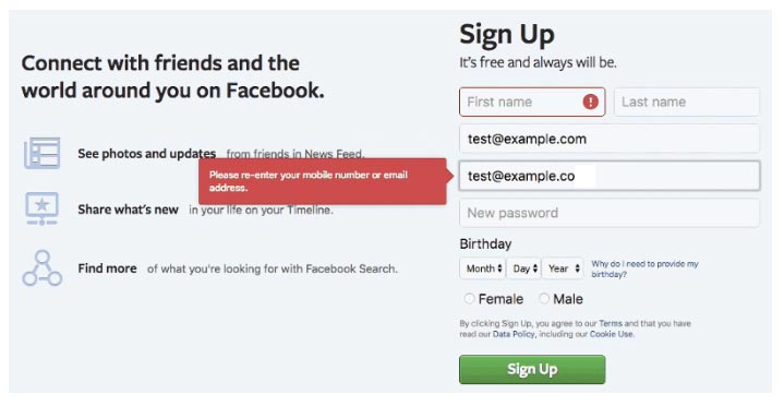
This form lets the user know about the error as soon as they make it.
If a user enters information incorrectly, it’s better to let them know right away. Only highlighting errors when the user hits submit can be frustrating. If their password is too short or their phone number format is wrong, let them know immediately so they can rectify it before moving on.
Is Automation Agency the right fit for you? Take this quick quiz to find out!
Form Design with Automation Agency
At Automation Agency, we understand the importance of high-conversion web forms for your marketing strategy, and we have years of experience designing web opt-in forms that increase conversions.
If you need to add opt-in forms to your website, or if you feel your online forms could perform better, get in touch with us today to discuss your options.
