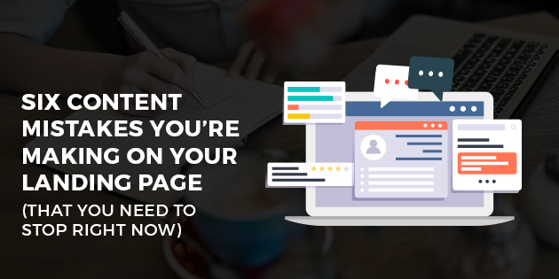
The content on your landing page needs to make it easy for prospects to enter your funnel. A well-designed landing page draws people in and encourages them to give you their information.
You likely have several ad campaigns running and sending prospects to landing pages. You already know the process at play here.
The prospect clicks on an ad and gets sent to the landing page. On that page, they give you their details and officially enter your funnel.
The problem is that this cycle breaks down when the landing page isn’t up to the right standard. Many marketers make the mistake of thinking that they’ve already done all the hard work once somebody has clicked on an ad. But that’s not true at all.
It’s the content on your landing page that has the biggest effect on lead generation. If prospects don’t like what they see here, they’re not going to send you their details just so they can get more of the same.
That’s why it’s so crucial to get your landing page content right.
And to do that, you need to understand how people often get it wrong. In this article, we’re going to look at the biggest landing page content blunders. If you avoid these mistakes, your content has a better chance of helping you generate leads.
Mistake #1 – Striking the Wrong Balance
Imagine that you’ve clicked on an ad and hit a landing page…
And you see a massive wall of text. There’s paragraph after paragraph of content for you to work your way through. For all you know, that wall of text might contain some valuable information.
But you’re not going to stick around to find out, because you don’t want to spend an eternity reading through it.
Now, imagine the other side of the coin…
You hit the landing page and all you see is a headline, a form, and maybe an image. This time around, there’s not enough context to the offer. The lack of context is just as likely to convince you to click away.
The point we’re making here is that balance is important when it comes to the content on your landing page.
You need to provide enough information to help the prospect understand more about who you are and what they need to do. However, you can’t share so much information you intimidate the client into leaving.
Remember that the purpose of a landing page is to convince the prospects to send across their details. You’ll be able to go into more detail about yourself once you’ve done that.
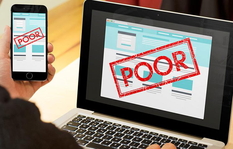
Mistake #2 – Having a Cluttered Design
This article is more about content than design, so we won’t focus too much on this mistake.
However, having a cluttered design has a direct impact on your results. It changes how your visitors perceive the content, which has an effect on whether they choose to dig deeper into it…or not.
A cluttered layout makes it harder for the visitor to navigate through the content.
The goal here is to have a layout that’s easy to follow. Typically, this means leading the page with a headline, followed by a subheading to add context. A couple of paragraphs of text may follow, along with some useful images.
The key is that you arrange all of these things in a way that makes sense to the visitor. The design needs to lead them from one piece of content to the next until they hit your call to action (CTA).
Automation Agency can help you create an attractive landing page design. Send a ticket to the Concierge Service to get started.
Mistake #3 – Poor Typography
Your goal with a landing page is to make it as easy as possible for visitors to send you their details. That means you can’t have them straining to read your content. They need to be able to glance at it and immediately be able to read it.
One common mistake is trying to get too creative with your typography. For example, you may decide to use a fancy font in an effort to make the page look more attractive.
The problem is that a font like this…
…Is that it’s not easy to read. You’re asking the reader to pay that extra little bit of attention to figure out what you’re trying to say.
The same goes if you use a really small font size. Again, you’re asking the reader to put more work into reading. They may have to lean closer to the screen or zoom in to make the font readable.
And frankly, a lot of people won’t do that.
Keep your typography clear, crisp, and appropriately-sized. Having great content doesn’t mean anything if you don’t present it in a way that makes it readable.
Mistake #4 – Not Being Clear About What You Do and Who You Help
Every single person who hits your landing page does so because they have a problem. And your ad has piqued their interest to the point where they think you might be the person to solve that problem.
You need to ensure that the content on your landing page gives those people the answers they’re looking for. That means being crystal clear about the problems you solve and the types of people you help.
There are two reasons for this.
First, this content will confirm the prospect’s idea that you might be the person to help them. So they’re more likely to send their details across to you.
Second, that clarity also helps you weed out unqualified prospects. Somebody may see your content and realize that they don’t have the type of problem you solve. That means they don’t waste their time sending you their details. And you don’t waste time nurturing a prospect that goes nowhere.
Mistake #5 – A Lack of Inspiring Imagery
When we talk about content, we’re not just talking about the text on your landing pages. The imagery that you use is just as important.
Quality images capture the attention of people who respond better to visual stimuli than text. Good images are also useful for directing attention toward your content. For example, an image that features a person looking towards your CTA will cause the visitor to look in the same direction.
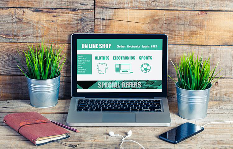
Aim to use imagery that’s unique to your landing page. Stock images generally don’t inspire confidence in your business, because they’re not authentic. Visitors can see that you haven’t created the images, which makes your offer seem questionable too.
You need images that are relevant to the offer you’re making. Ideally, they’ll highlight your product or service, and may even showcase a transformation.
The key is that any image you use needs to transmit a piece of information. Whether it’s a simple case of “look over here” or something that showcases your offer, the image has to inspire action.
This is another area where Automation Agency can help you. Send a ticket to the Concierge Service if you need help with creating images for your landing pages.
Mistake #6 – Creating Unnecessary Friction
Think of friction as anything that creates a barrier between your visitor and the action you want them to take.
For example, forcing your visitors to read through several case studies before reaching your form is a type of friction. Those cases of studies likely to contain valuable information. But forcing the visitor to go through them just creates unnecessary obstacles.
Aim to make the path to your CTA as clear as possible. To do this, put yourself in a visitor’s shoes. If you see any content that gets in the way, get rid of it.
Have You Mastered Your Landing Page Content?
You have to think about more than just the quality of your content when creating your landing page.
Achieving the right balance between informative and frictionless is one of the keys. So is using the correct type of imagery to inspire action on the part of your visitors.
You also need to consider how your design accommodates your content. A lot of clutter will just confuse visitors, which leads to them bouncing away. Furthermore, poor typography creates an added barrier for them to get through.
At Automation Agency, we offer several services that can help you create better landing pages. These include image design and A/B testing if you want to see how two pages stack up against each other.
Send a ticket to the Concierge service to find out more. Or chat with our Right Fit Chatbot if you’re not a member yet.
