You’ve spent months writing your new book. Now, it’s time to make sure that it looks as good as it can.
Why should you write an eBook for your business?
Good books help you build authority in your niche. They show that you have a huge amount of valuable knowledge and that you’re capable of solving your prospects’ problems.
In fact, just being able to say that you’ve written a book helps you to command a certain level of respect.
eBooks are also amazing marketing tools. For example, you could use one as a lead magnet to attract prospects to your email list. Once you have the email address from a prospect, you can build on the book’s content with an automated email campaign. Those emails nurture the prospect through your sales funnel until they’re ready to buy from you.
Automation Agency can help you to build both the landing pages and the automated campaign if this is the route you want to take.
Of course, you can also create eBooks with the intention of selling them. This means that your book becomes a new, and permanent, revenue stream for your business.
So, now you know the “why”.
But what about the “how”?
Many business owners make the mistake of thinking they just need great written content for their eBooks.
While that’s crucial, how your book looks plays a huge role in its success as well. If you’re just presenting page after page of text, many of your readers will likely tune out.
And if that happens, the eBook won’t serve its ultimate purpose of driving revenue for your business.
That’s why it’s so important to focus on eBook design. And with these tips, you can ensure that your book looks the part.

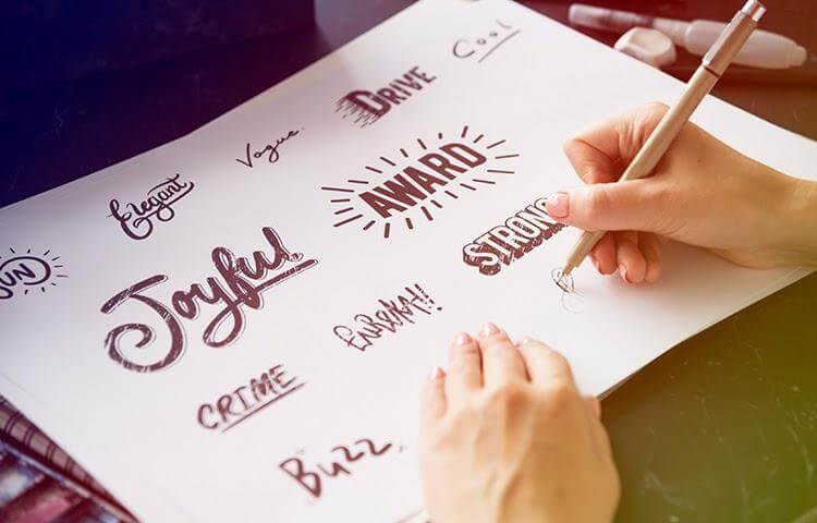
Tip #1 – Create Your Brand Guidelines (And Stick to Them with the Book)
Why does your business need brand guidelines?
They help you keep your content looking consistent across all platforms. That’s crucial when you’re trying to build trust with an audience.
Prospects may start to doubt your authenticity if all of your content looks different. They may even get confused about whose content they’re interacting with. Pieces that don’t match your guidelines aren’t immediately linkable to your brand.
Ultimately, this makes those pieces less effective.
If you haven’t already, you need to create brand guidelines for your business. This typically involves the following:
- Outlining the colour schemes that your pieces use
- Solidifying the overall message that runs through all of your content
- Creating logo guidelines
- Defining your brand’s voice
- Outlining rules for typography and image use
Get those guidelines on paper and apply them when designing your eBook. You want the reader to immediately associate the book with your business whenever they open it.
Tip #2 – Test How the Book Looks on Different eReaders
It’s tempting to think of Amazon’s Kindle as the only eReader out there. While it does have a massive market share, there are still millions of people who use different devices.
Your book has to look the part in all of them. This means you have to test your eBook on as many different eReaders as possible.
You’re looking primarily for inconsistencies in formatting. For example, some eReaders may not be able to display your chosen font. Or, you might find that the images you’ve used don’t meet the eReader’s criteria.
Even something as small as the font size could mess things up. A larger font would mean that your contents page doesn’t align with what the reader sees.
Aim to at least test the book for the following eReaders:
- Kindle
- Kobo
- Nook
- Onyx
If the book looks good in all of them, you’re ready to launch. But if it doesn’t, you may need to make changes or create a specific version of the book for the eReader that’s causing issues.
Tip #3 – Follow the Same General Format as a Regular Book
With the online format, you’re able to do a lot of things that you can’t do with a traditional book. This is great when it comes to introducing new design elements or leveraging things like hyperlinks.
However, you shouldn’t forget that people have certain expectations when it comes to book formatting.
For example, most expect to see a contents page, especially for a non-fiction book. Any copyright pages or terms and conditions come at the start of the book. Plus, any title pages should be at the front of the book, too.
The point is that you shouldn’t deviate too far from the standard book formatting with your eBook. You want the book to feel familiar, rather than forcing the reader to deal with formatting that seems strange to them.
Your branding makes the book unique. Don’t make the format a confusing mess of new ideas that make the book harder to read.
Tip #4 – Create an Eye-Catching Front Cover
As nice as the idea of literally not judging a book by its cover may seem, the simple fact is that we all do it.
The front cover is the first thing a potential reader will see of your book. If it makes a poor impression on them, they’re less likely to explore beyond it.
The good news is that a good front cover doesn’t have to be especially complex. The key elements are:
- An attractive image that aligns with the contents and purpose of the book
- A large font that helps the title stand out
- Clever use of colours, ideally using those that align with your branding
The image is particularly important. Aim for an instant impression of what your book’s about.
Imagine that you’re buying a romance novel. Typically, the front cover will feature an image of a couple within the context of the story’s setting. This gives the potential reader an instant impression of what they can expect from the book.
When it comes to the font, size matters because you want the title to stand out. However, you also need to consider typography. A font that’s difficult to read means the prospect has to work harder to figure out what the title says. That extra effort can end up being a turn-off, as it indicates you’re putting little thought into making it easy to consume your content.
This tip about the font extends to what you use inside the book. With an eBook, you have the choice of hundreds of font variants. Still, it’s best to stick with something familiar, like Arial or Times New Roman. Again, this comes back to the formatting expectations we mentioned earlier. If you choose a cursive, you’re sacrificing ease of reading for a unique look.
Tip #5 – Design an Attractive Thumbnail for Your eBook
Think about the last time you browsed an eBook store. You likely saw a lot of thumbnail images of titles, which were probably miniature versions of each book’s front cover.
That’s okay, as long as the front cover’s designed in such a way that it’s appealing even in a smaller format. But if your cover loses something in the translation, you’ll need to design a separate thumbnail.
The rules for this are pretty similar to those for creating your front cover. However, the key consideration is the smaller size that you’re working with.
Anything you incorporate into your thumbnail needs to be large enough to catch somebody’s eye while they’re browsing. But at the same time, it can’t be so large that it overshadows all other elements included in the image.
It’s a delicate balance to strike, which is why it’s often best to have professional designers work on your thumbnail. The Automation Agency team can handle this for you if you send a task to the Concierge Service.
Tip #6 – Use Colours (But Don’t Go Overboard)
Colours should complement the book’s content, rather than overshadow it. If every page features massive splashes of colour, you’ll distract the reader from the meat of the book. They may struggle to read the content, simply because the colour draws their eye away from it.
That’s why you should use colour sparingly inside the book.
Generally speaking, you should use colour when you want to draw the reader’s eye to something. For example, you could have a breakout box that features a different background colour to the rest of the book. This tells the reader that the box contains important information that they should check out.
Where possible, ensure these colours match up to your branding guidelines. However, you can occasionally use something else, should you need a colour for a specific purpose.
For example, you may want to use a splash of red to emphasise crucial content points. Red is a vibrant colour that catches the eye immediately, so it’s useful even if it isn’t one of your brand colours.
Tip #7 – Visual Hierarchy Is Still Important
Colour isn’t the only tool that you have to draw the reader’s attention to certain parts of the book. You can also leverage the visual hierarchy for the same purpose.
Generally, you’ll use different font sizes to do this.
For example, a chapter title will often have the largest font size to denote the beginning of a new section. The content itself will have the smallest font size of everything on the page. And any subheadings will have a size that falls between the two.
Viewing all of this on one page means the reader goes through the following process:
- They see the chapter heading first, which tells them the general topic they’re going to read about.
- They’ll then see the subheadings, which tell them the specifics of what the chapter covers.
- Finally, they’ll start reading the content itself. They may even use the subheadings to skip to the most valuable piece for them in the chapter.
Failing to follow this visual hierarchy will confuse your reader. Again, this makes it harder for them to absorb the book’s content.
Design Is as Important as Content
If you follow these tips, you’ll end up with an eBook that looks the part as well as one that’s packed with useful information. You’ve spent months creating your content and you want to ensure it makes the highest impact possible.
But what if you’re not a designer?
This is where our team at Automation Agency comes in.
We can take your content and brand guidelines to design an eBook that looks amazing. We handle everything – from image design to internal typography.
If you provide the steak, we give it the extra sizzle.
Send a task to the Concierge Service to find out how we can help you create an amazing eBook. And if you’re still unsure if we’re right for you, check out the range of services that we offer to our members.
