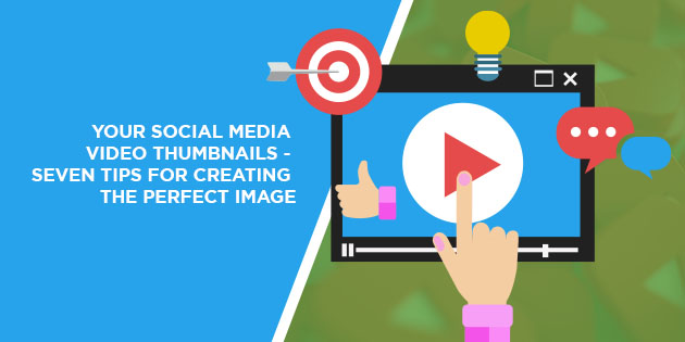
Your video’s finished and you’re ready to launch it on your social media accounts. But before you do, you’ve got to create a great thumbnail.
Year after year, the video becomes more important to any social media strategy.
Take Twitter as an example. Right now, tweets that contain videos achieve 10 times more engagement than those that don’t. And if you’re running a paid campaign, you’ll spend 50% less on your cost per engagement if you use videos.
What about Facebook?
As of 2019, Facebook users view 4 billion videos per day. They also achieve the highest engagement levels of any type of Facebook posts. On average, videos achieve a 6.01% rate. That’s higher than text statuses (2.21%) and even posts that contain images (4.81%).
Simply put, video is the way forward for your social media strategy.
And you may have created some absolutely spellbinding videos to account for this. You may have a bunch of videos that you feel certain will engage prospects and lead to sales.
But… why isn’t anybody watching them?
Why do you upload videos onto your social media channels only to achieve terrible viewership stats?
The answer may lie in the video’s thumbnail. This is the image that gets presented to the prospect before they click to watch the video. And if that thumbnail doesn’t entice them to watch, you’re going to find you have fewer views than you deserve.
You need to solve the thumbnail issue to gain great viewing stats. And with the help of these tips, you’ll be able to create eye-catching images that convince prospects to view your videos.
Tip #1 – Include Simple Graphics and Shapes
The goal with any thumbnail is to get a simple message across quickly.
If you have a cluttered image, you’re just going to confuse anyone who sees it. People may stop and look at it, but only for a couple of seconds. If they can’t figure out what it’s supposed to mean, they’ll just scroll past.
Simplicity in your graphics is the name of the game.
Ideally, you’ll have a single image that serves as the foundation of the thumbnail. You may overlay these with other graphics. But if you do, they need to offer something to the image, rather than just being there for the sake of having extra pictures.
You can see this in action in a lot of the “reaction” video thumbnails that you see on YouTube. These usually contain an image of whatever the poster’s reacting to, coupled with an image of their face reacting.
This tells the viewer exactly what to expect. They know what the poster’s reacting to and they can see it’s a reaction video, thanks to the slightly exaggerated face picture.
Your images likely won’t feature the exact same elements. However, you can take inspiration from the simplicity of the graphics when creating your thumbnails.
Tip #2 – Use Text Sparingly
It’s inaccurate to say that text has no place in a thumbnail image. Truth is, it can be an invaluable way to communicate what the video’s about if the graphics alone can’t do so.
However, you do have to take care when using text in your thumbnails. The key here is that you can’t have tons of text in the image. For one, this turns off a lot of viewers immediately because it suggests that the video’s really complex.
Furthermore, tons of text could create confusion about what this thumbnail actually is. Some people may just read the text and scroll right past under the assumption that they’ve seen the full message.
In other words, they may not even realise that there’s a video to watch.
There are two key things to keep in mind when incorporating text into your thumbnail:
- Keep it at seven words or below. A short and simple statement always works best here.
- Use an easy-to-read block font. Again, this is all about getting your message across as quickly as possible.
Tip #3 – Use Yellow Whenever Possible
Did you know that yellow is one of the best colours to use for a video thumbnail?
Tubefilter, which is an online video curation website, explains why yellow is such a great colour for thumbnails:
“This is primarily due to the fact that humans only perceive the colour yellow when both the M-Cone (Green) and L-Cone (Red) are stimulated (or essentially when green and red light is mixed). This causes more receptors in our eyes to trigger, making yellow stand out more.”
In other words, yellow grabs attention because it engages more of our eye.
Try to use yellow in your image backgrounds wherever possible.
Then, add different elements with the next tip…
Tip #4 – Use Contrasting Colours
You’ve used yellow to grab the viewer’s attention.
But simply having a single colour isn’t nearly enough to keep that attention. With yellow as your backdrop, the goal now is to use contrasting colours to make other elements stand out.
For example, let’s say your thumbnail has a little bit of text.
You don’t want to overlay that text onto the yellow background. Instead, create a graphic block of a different colour, such as red, to serve as the background for the text.
Now, you’ve used the yellow to get attention. Then, you’ve used a contrasting colour to draw the eye to a section of the image that provides context.
These are all elements of design that Automation Agency takes into account when creating images for our clients. Send your task to the Concierge Service if you need help with image design.
Tip #5 – Use an Image of a Face
Let’s come back to the “reaction” video thumbnails that we spoke about earlier.
Now, part of the reason why reactors use pictures of their own faces is to add context to the thumbnail. The picture usually shows them in the middle of a reaction, which tells the viewer what they’re about to watch.
However, having a picture of a face offers other benefits.
One of these is that it adds a personal touch to the thumbnail. This is particularly important if you’re looking to build a personal brand. Your face shows viewers that you’re a part of the video, which may lead them to click automatically.
Pictures of a face also help build an instant connection, especially if the person in the image is “making eye contact”.
In other words, if they’re looking directly into the camera lens when you take the shot, you create the illusion of eye contact. Again, this grabs attention and makes the viewer more likely to click.
Tip #6 – Adapt Based on the Platform
Beyond what you can add to the image, you also have to consider what your chosen platform may do to your thumbnail.
For example, YouTube often adds a red bar at the bottom of an image to show that the viewer’s already watched the video. There’s also usually a timestamp in the bottom-right corner.
You need to ensure these added elements don’t get in the way of the important elements of your thumbnail.
Unfortunately, Facebook gives you a few more issues to worry about.
Thumbnails for these videos also include a timestamp on the bottom-right. However, it also adds our profile image or default logo to the bottom-left. And there’s also the “WATCHED” tag, which goes at the top-right if the viewer’s seen the video, to consider.
Again, you have to adjust your image to ensure these elements don’t clash with what you’ve built into the image.
Tip #7 – Design for All Screen Sizes
According to WordStream, more than 50% of videos posted to social media platforms get viewed on mobile devices.
That’s such an important stat to keep in mind when designing your thumbnail image.
The image may look absolutely perfect on large displays, like on your computer. But when you crunch it down for mobile devices, you may discover it suddenly seems cluttered and fuzzy.
The key here is to design with all devices in mind. You don’t want to miss out on views because your thumbnail doesn’t display well on a mobile device.

Make Your Thumbnails Stand Out
With so much effort poured into your video, it’s easy to forget how important the thumbnail is.
Think of this image as a quick sales pitch. You need to catch attention and tell the viewer exactly what the video has to offer in the space of an image.
It’s not an easy task.
The good news is that Automation Agency can help you with several aspects of image design. Send your task to our Concierge Service to get started.
But perhaps you’re not yet a member.
That’s okay too. Talk to our Right Fit Chatbot to see if we’re a good fit for your business.
