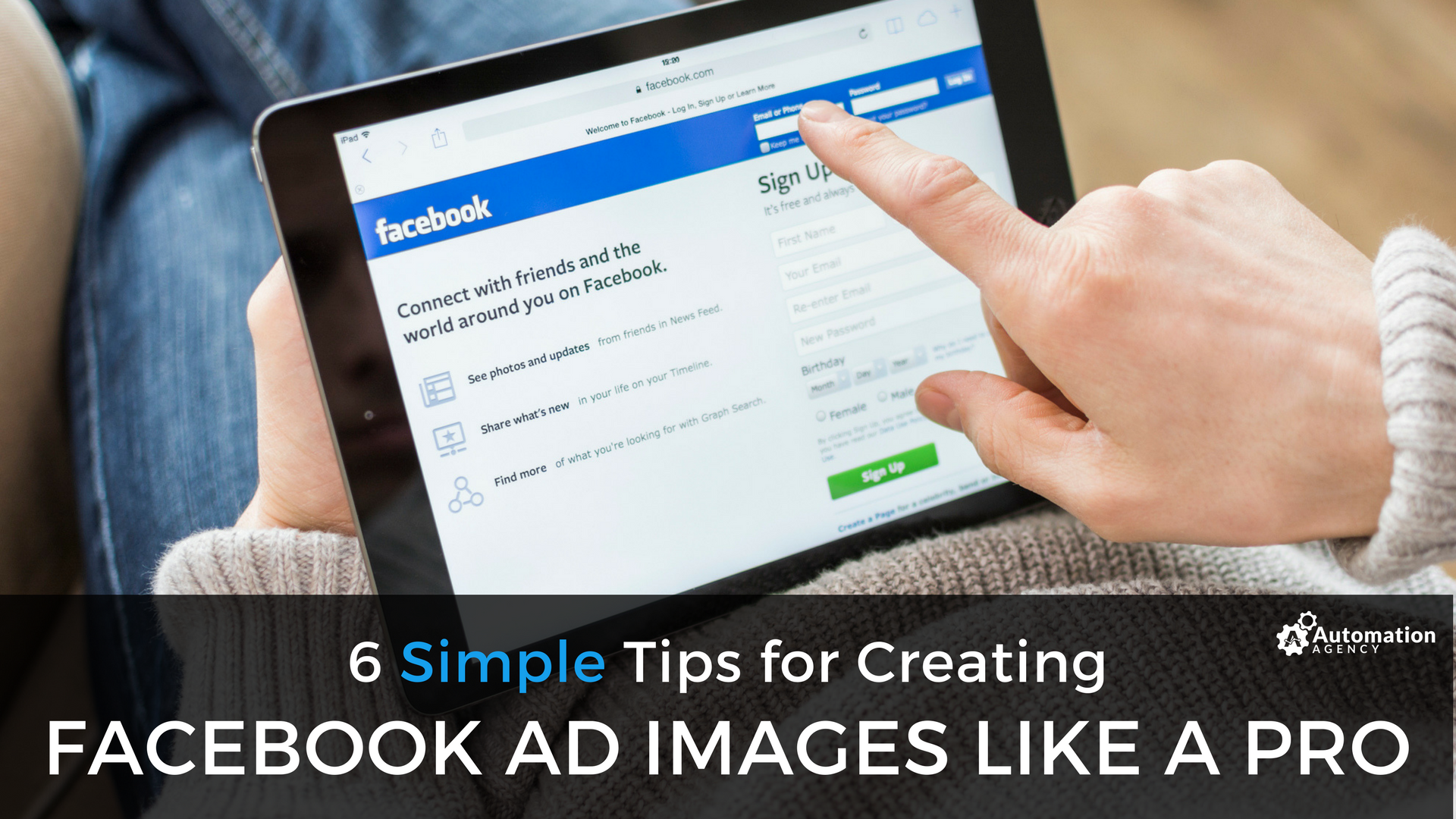
Facebook has over a billion active users. Chances are your ideal customers are using the platform at this very moment. So how do you reach them in a scalable way that actually impacts your business?
With Facebook Ads, of course!
However, connecting with potential customers via ads is easier said than done, especially if you’re using the wrong images with your ads. You can’t just throw money into a Facebook ad campaign and expect it to be successful.
The image you choose is one of the most important elements of your ad. Get that wrong, and you’ll be throwing money right into the trash. There’s no point in testing ads, changing headlines, and tweaking ad copy, if you’re using the wrong image.
Below, we offer our best tips for creating Facebook ad images, and even a few examples to inspire your next ad.
Our Top Facebook Ad Image Tips
Your entire Facebook ad should work together to further the goals of your campaign. However, the image is one of the weak links we see time and time again. Below, you’ll find our best guidelines to keep in mind when choosing images for your Facebook ads.
1. No More 20% Text Rule (Well, Sort Of.)
For years, Facebook would reject ads if they contained more than 20% text. Recently, however, they made a change to how they deal with text on images. Now they rate ads as Okay (little or no text), Low, Medium, or High text.
Facebook prefers ad images that have little to no text, but you can still get your ad approved if it contains text. However, it’s important to ask yourself what the purpose behind the text is in the first place.
You should create a few different images with varying amounts of text and test them to see which performs best. (We go into this in more detail below.)
2. Say the Right Things.
When it comes to the length of the copy in your ad, shorter text tends to perform better. Filling your ad with text will only make it hard to read and turn off your visitors.
The main goal of your image should be to grab the attention of your visitor. The photo should also support the rest of the copy in your ad. If your copy is concise and to the point, then you won’t have to worry about having to explain yourself.
Your image could contain a simple call-to-action, or you could reinforce the benefit highlighted in the headline.
3. Be Careful With Stock Images.
When it comes to choosing the right image, you need to pick something that’s unique and stands out. Stock photos, even quality images, are everywhere today. So, if you want to compete, then you’re going to have to do something different.
Facebook ads come equipped with a massive stock photo library you can use. But we recommend creating or taking your own images if you have the time and the budget.
Once again, you’ll need to test to see what works best.
4. Consistency Is Key.
The images you choose need to be consistent with your landing page and the ad copy. Using an image that’s not in alignment will only cause cognitive dissonance in your reader.
For instance, if you’re running an ad that advertises a webinar you’re hosting, don’t choose an image of an in-person seminar room. Your ad photo should take cues from your headline, or at the very least align with the emotional state you’re hoping to invoke in your reader.
Also make sure your image choice and ad copy is the same as the landing page you’re sending your visitors. In some cases you could even use the same image and copy on your landing page.
5. Use Eye Contact the Right Way.
Images of people’s faces expressing certain emotions can be quite helpful and engaging. But, if the image you’re using shows someone’s eyes at all, then make sure those eyes are directed at the image text.
Your reader’s eyes will naturally be drawn to the same place where the eyes on your image are looking. Pretty cool hack, right?
6. Test, Then Test Some More.
The most important thing to do with your ads is to test. We can make recommendations based upon data and past successful campaigns, but you really only know what will work for your business when you start testing.
Before you invest in a long-term ad campaign, you should test multiple variations of your ad to optimize your conversions.
Facebook Ad Analysis and Examples
Now that you know what it takes to create a successful image for your Facebook ad, it’s time to dive into a couple of our favorite Facebook ad examples.
Facebook Ad Example #1
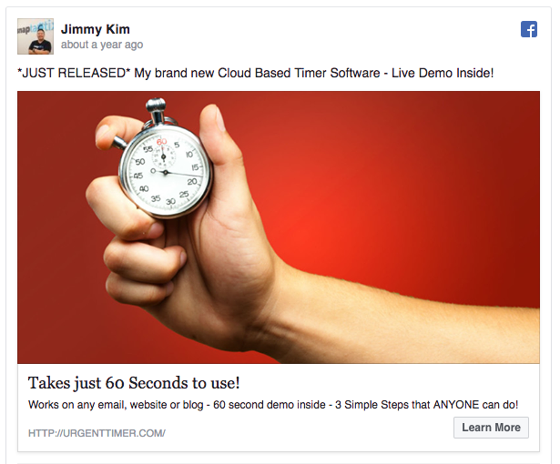
The first ad we’ll look at is for a new cloud timer software from Jimmy Kim. At first sight, the image is quite powerful and works well with the rest of the copy.
WHAT WE LIKE ABOUT IT:
- There’s no text on the image, but the stopwatch, along with the red background, helps to convey a sense of urgency.
- This ad is clean and simple, and it manages to make the viewer want to click, without being overwhelming or pushy.
Facebook Ad Example #2
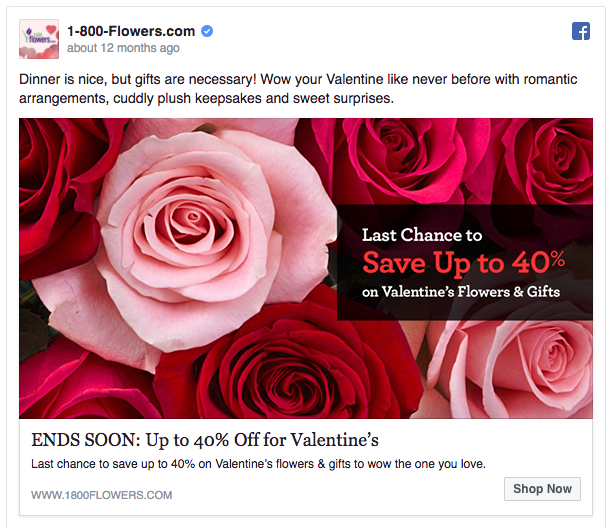
Next, we’ll look at an ad by 1-800-Flowers. This ad really nails the Valentine’s day energy. If you’re looking for last-minute flowers for a loved one, then you can bet this ad will catch your attention.
WHAT WE LIKE ABOUT IT:
- The bright red image really draws your eyes to the ad, and the copy in the image reinforces the final call-to-action. A great, and likely high-converting, ad.
Facebook Ad Example #3
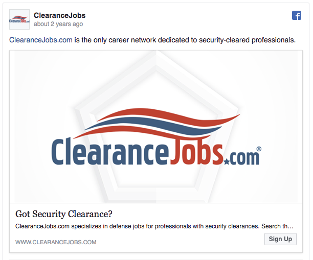
Finally, we’ll take a look at an ad from ClearanceJobs.com. Now, at first sight, this ad isn’t very impressive. They utilize their logo instead of an attractive image. But that’s because we’re not the target market that the ad is speaking to.
WHAT WE LIKE ABOUT IT:
- This ad illustrates the importance of knowing your target market and testing until you get your desired result.
- The red, white, and blue logo is clearly aimed at those who support the country and have security clearance.
- The straightforward and terse approach of this ad works well for their target market.
If you’re looking to create a stunning Facebook ad image, why don’t you let our team help you get there? We can help you design a high-converting image ad to help increase your conversions and grow your business.
